This post contains affiliate links. Read the full disclosure here
Not too long ago, it was all about millennial pink. Now the color du jour is ochre.
It kind of popped up out of nowhere, a hybrid of the trendy “millennial” neon yellow and perhaps Pantone’s 2018 darling ceylon yellow.
All I can say with any certainty is that I started adding the hue to my hand lettering color palettes a few months ago because it paired well with pink and slate. And then I saw it everywhere.
Huffington Post reported that there’s been a 36% increase in searches for “ochre” on Etsy in the past three months and a 67% increase in searches for “ochre bedroom” and “ochre living room” on Pinterest.
The ochre color trend is most definitely in the zeitgeist now. And just in time for the fall season, where it feels right at home.
What exactly is ochre, anyway?
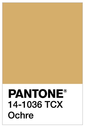
Let’s get really specific with a Pantone code. Pantone 14-1036 TCX. But I’ll just call this our friendly jumping-off place. Because ochre can run the gamut from a little lighter to a lot darker, so the shade doesn’t matter all that much.
If you’re on the hunt for something in this color, you could search anything from “mustard yellow” to “light brown” to “amber” to “rust” — and chances are, you’ll find ochre mixed in there somewhere, too. Search for “ochre,” though, and you’re likely to get a “no items found” message. Ochre is weird like that.
It’s more about the feeling, if you catch my drift.
What feeling is that? That retro feeling.

We’ll get back to that in a minute.
First I have to address another burning question: How the heck do you pronounce “ochre”?
It’s like “ogre.” With a crisp “k” sound instead of a hard “g” sound.
So, for all of you rhyming it with “chakra,” you can stop now.
Where have I seen ochre before?
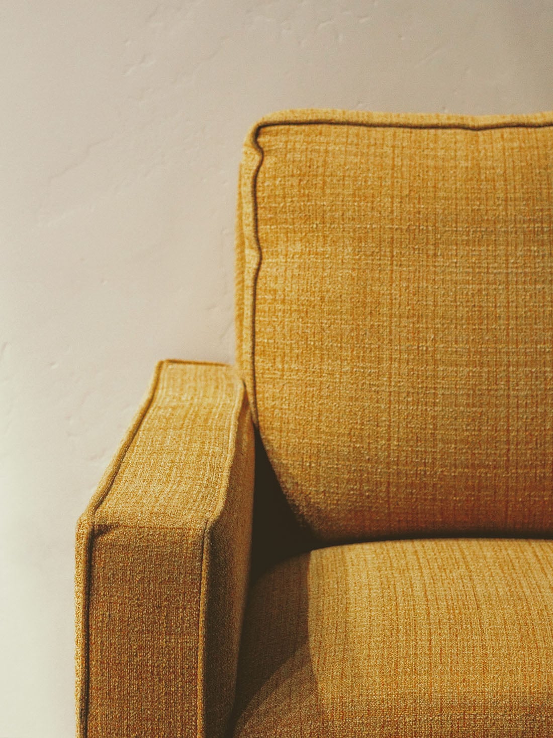
This color might be best remembered from your grandparents’ 1970s-era sofas. Bell-bottom pants. Brady Bunch fashion. The carpet in my brother’s room in the house we grew up in (built in 1973). Ceramic ashtrays of living rooms past.
Read: earthy, muddy — much like the avocado green and browns that were all over that decade, ochre was right in the middle of that movement.
At least, this was the last time ochre had a moment in recent memory.
The actual iron-rich rock from which the hue is gleaned has been around since the beginning of time — it was one of the earliest pigments used by humans, and not just for art purposes. It was used for everything from sunscreen to a rudimentary vitamins.
How to rock ochre

I love ochre, but I can’t wear the color to save my life because all yellow tones completely wipe me out or make me look sickly.
If you’re anything like me, this color palette guide may come in handy. Print it out and use it when you’re shopping — try buying clothing in blue tones, slate, minty green and pale pink, and accessorizing with ochre.
Likewise you can use this guide to put together a cohesive color palette for your bedroom or living room. Try an ochre sofa, for instance, with pink throw pillows and a rug with blue tones.
This post from Emily Henderson showcases some beautiful interiors that will help you envisage ochre in your space.
Ochre Color Trend: Gift Guide
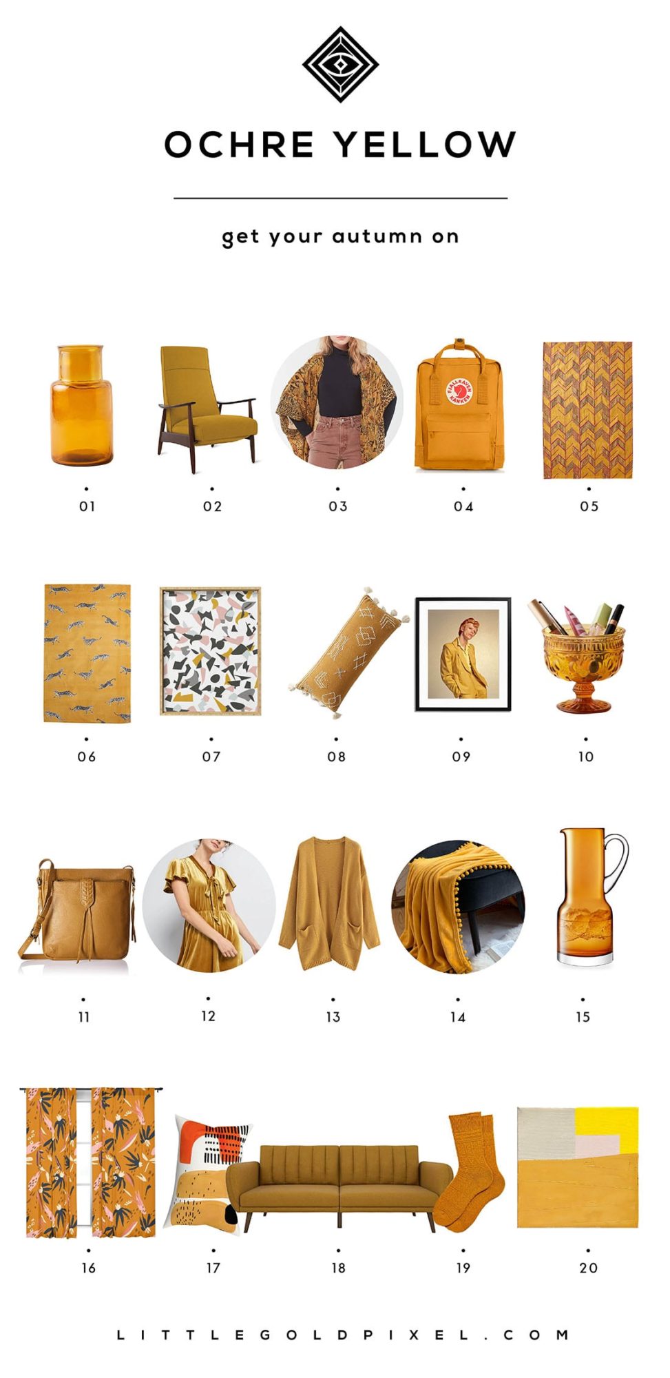
I’ve rounded up 20 bits of ochre that will really knock your socks off this fall.
Click on the corresponding link(s) below the image to shop!
P.S. See past Color Crush posts here.
Bookmark for later
Here are some ochre color trend graphics to add to Pinterest or your favorite bookmarking site:
