This post contains affiliate links. Read the full disclosure here
If you’re paying attention to typography trends, you might have noticed a recent uptick in retro serif fonts. And yes, by retro I mean 1980s and 1990s, as much as it pains me to admit that these decades are not just “10 years ago” anymore.
The other day my 5-year-old daughter told me with much authority that everything back in the “19s” was so long ago it was in black and white. I had to remind her that I, a person from the “19s,” am in color, although I do remember a time when newspapers were “black and white and read all over.”
In fact, reading the newspaper is a favorite childhood memory of mine. Every morning, I would wait for my mom to hand over the Arts & Culture section so I could check (in this order): my horoscope, the funnies and the review section for info about the movie I wanted to see that weekend. We would flip through the pages, savoring the smell of fresh ink and the rustle of paper. The headlines were bold, the text was clear, and everything was easy to read.
Those retro serif fonts were all over the newspaper and in my favorite magazines. (I’m looking at you, Seventeen logo and Gap ad.)
I first noticed this a few years ago, when I rounded up a bunch of what I then called “modern serifs,” aka elegant twists on tried-and-true vintage serifs.
Last year, AIGA wrote a piece about the return of text-heavy layouts and condensed retro serif fonts in advertising, with a heavy emphasis on 1980s styles and ITC Garamond — and I would argue that this typography trend is continuing and bleeding into the 1990s aesthetic as well, because 2023 has brought with it a wave of retro serif fonts that somehow feel even more fresh than when they were last popular.
I’m trying to figure out what is so appealing about the 1980s-1990s condensed serifs — maybe it’s the reminder of the original Apple identity. Maybe it’s the reminder of my youth thumbing through magazines, books and newspapers instead of scrolling on a device. I rarely get ink on my fingers anymore.
💡 TIPS & TRICKS
Five simple typography rules
I’ve rounded up 20 of my favorite retro serif fonts for you — feel free to use them in any design that needs a vibe of nostalgic sophistication.
Which one is your favorite?
Retro Serif Fonts Roundup
Scroll down to find the link to the font you love the most!
1. Absolute
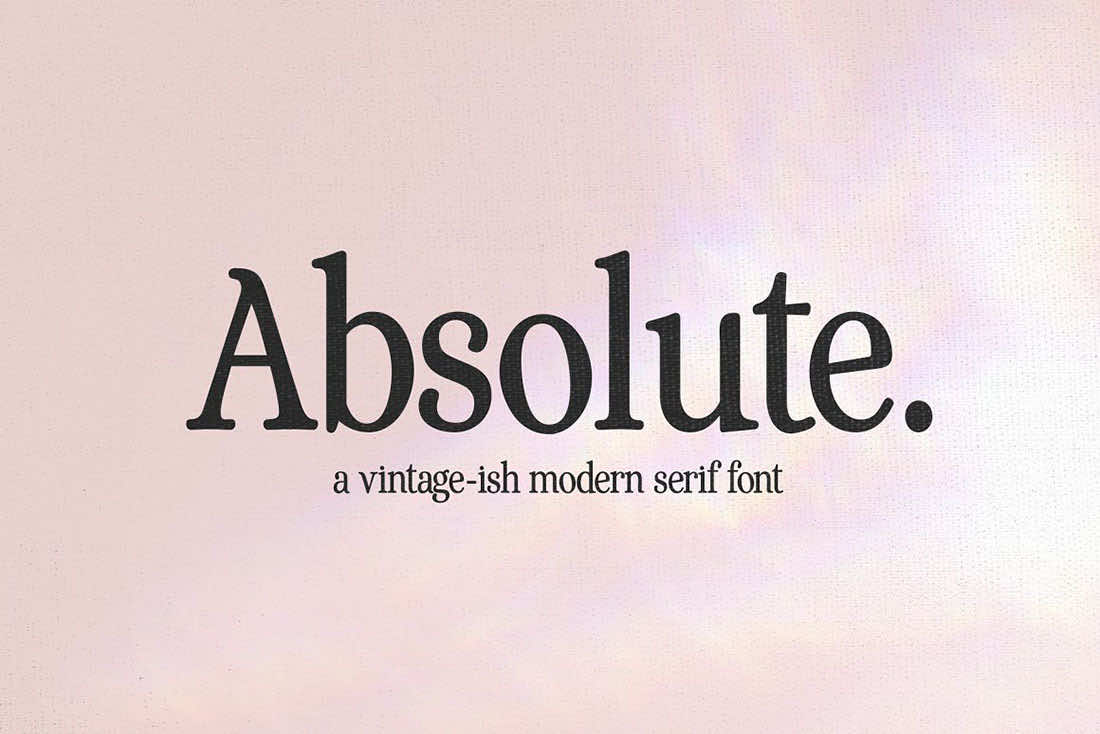
2. Adorable Memories
3. Awesome
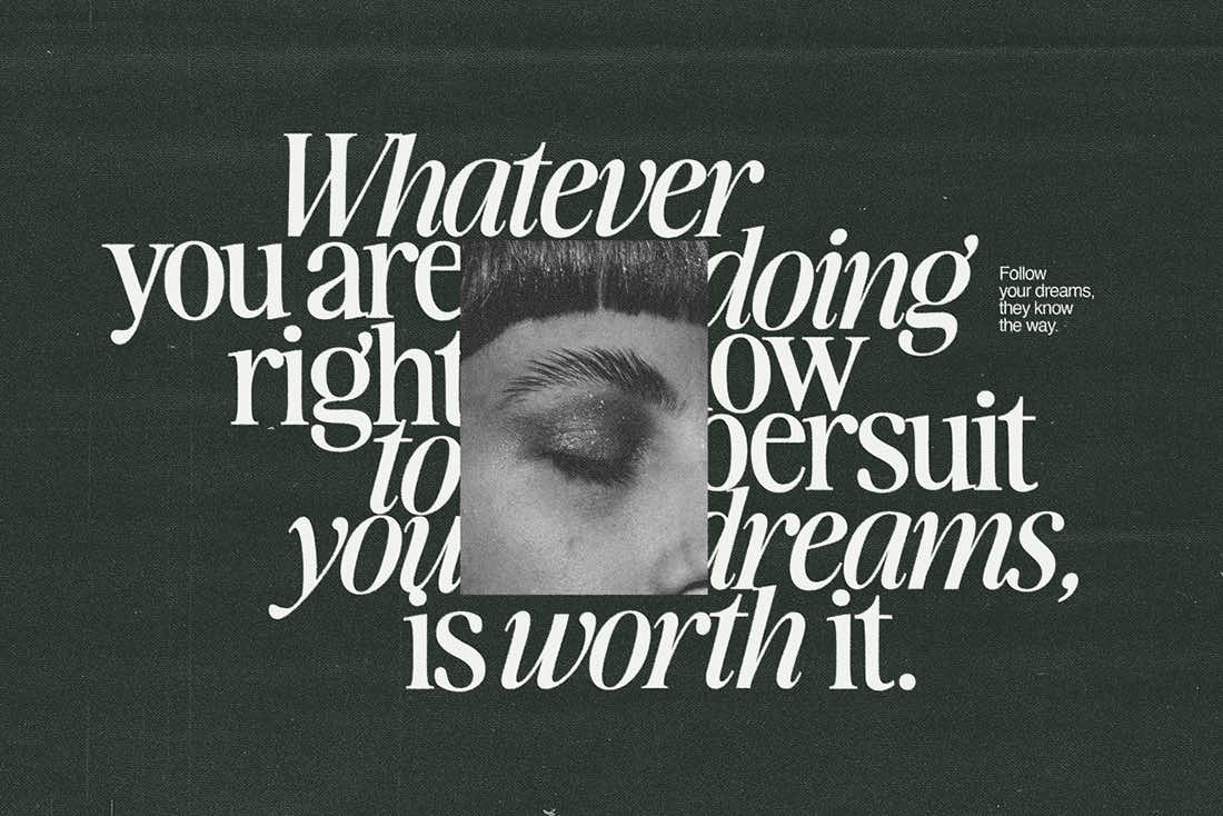
4. Dark Paradise
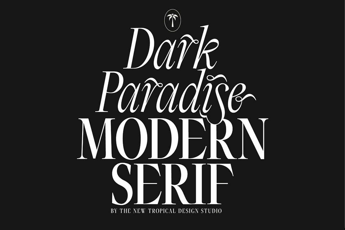
5. Editorial New (Free for personal use)
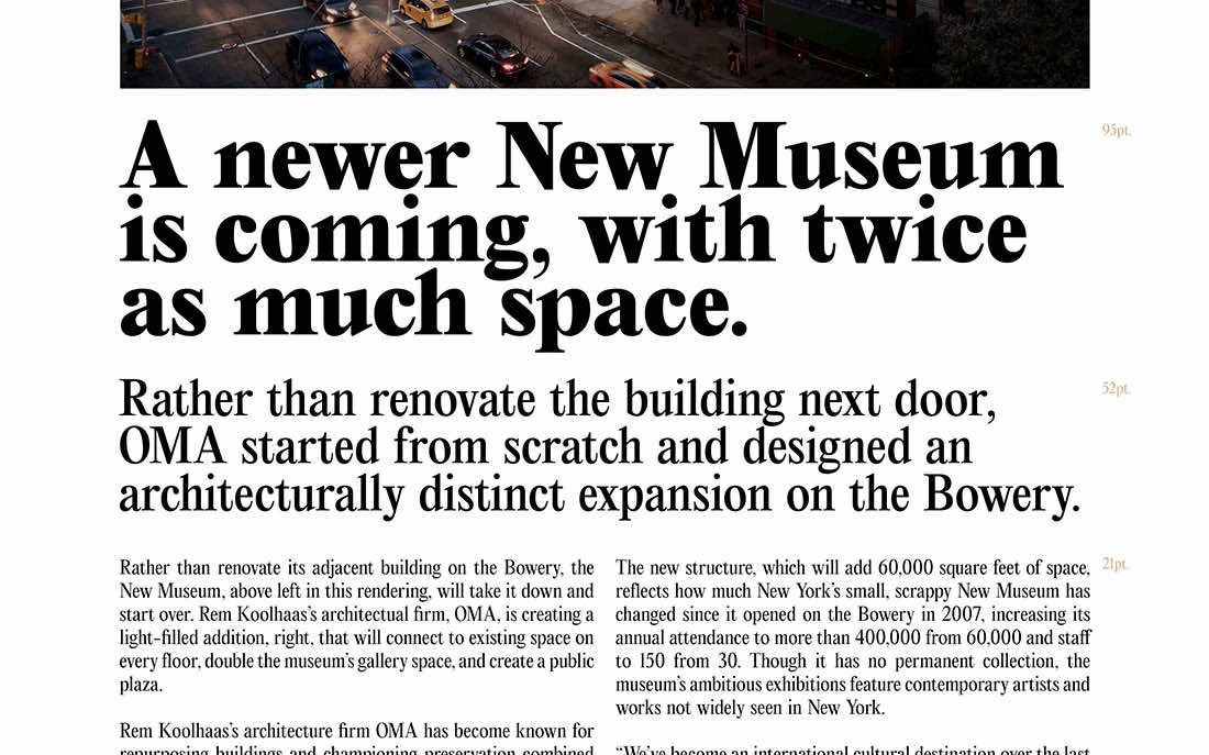
6. Editorial Old (Free for personal use)
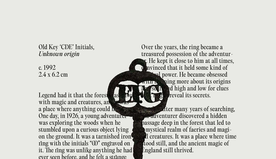
7. Eighties Comeback
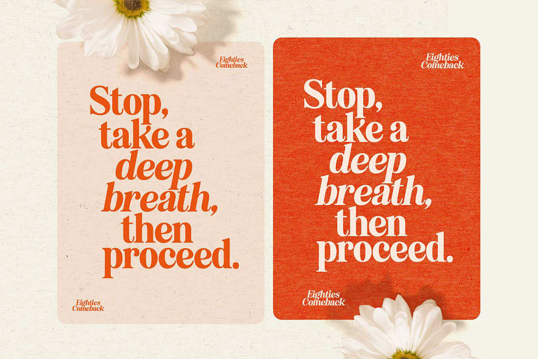
8. Girl From Nowhere
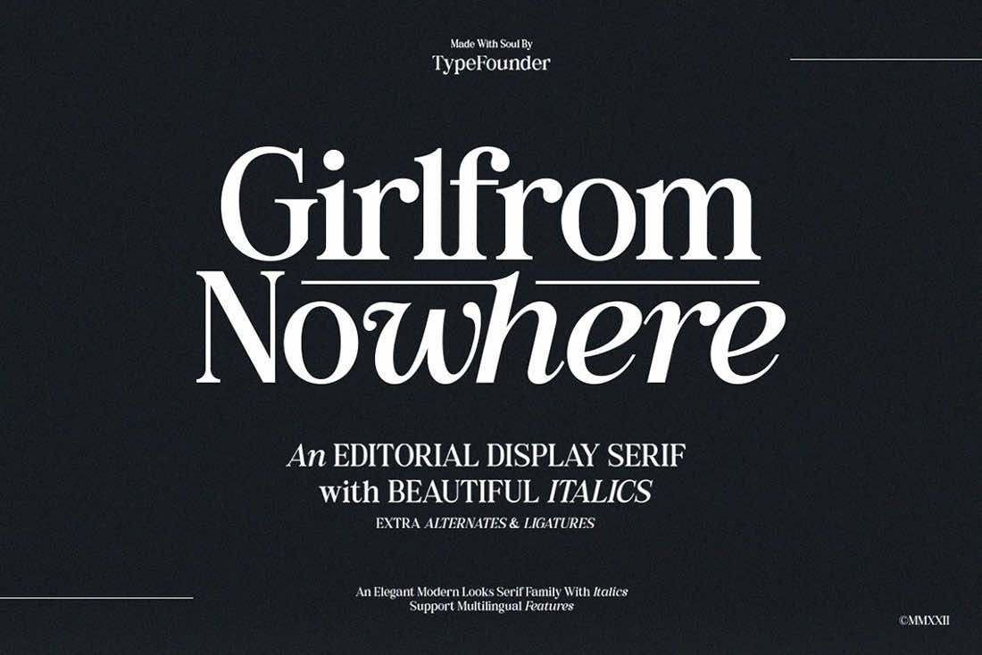
9. Hickory Dickory

10. McKenzie Headline
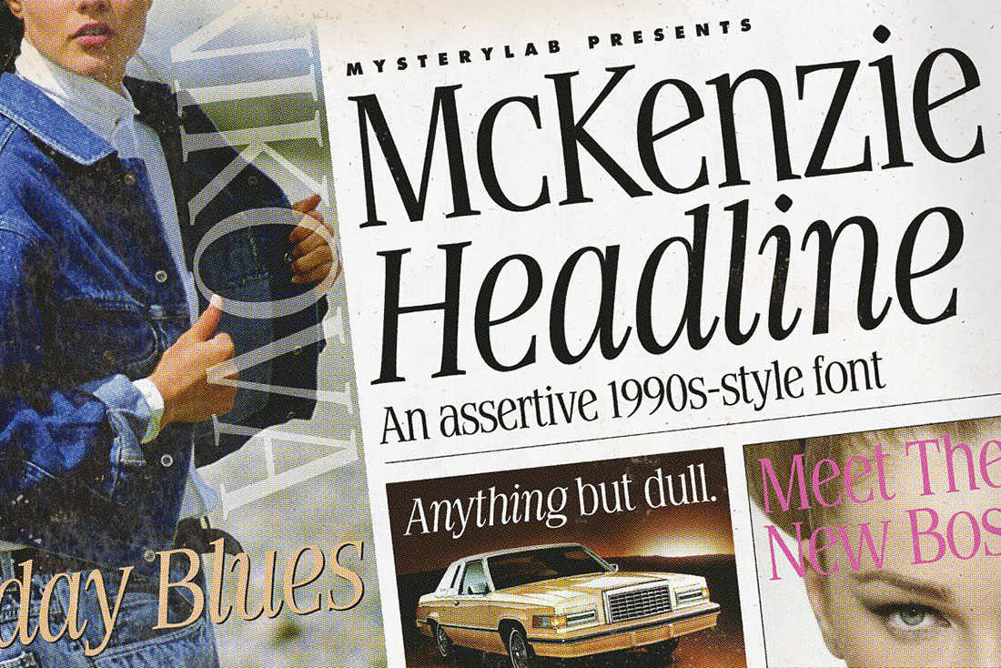
11. Memories
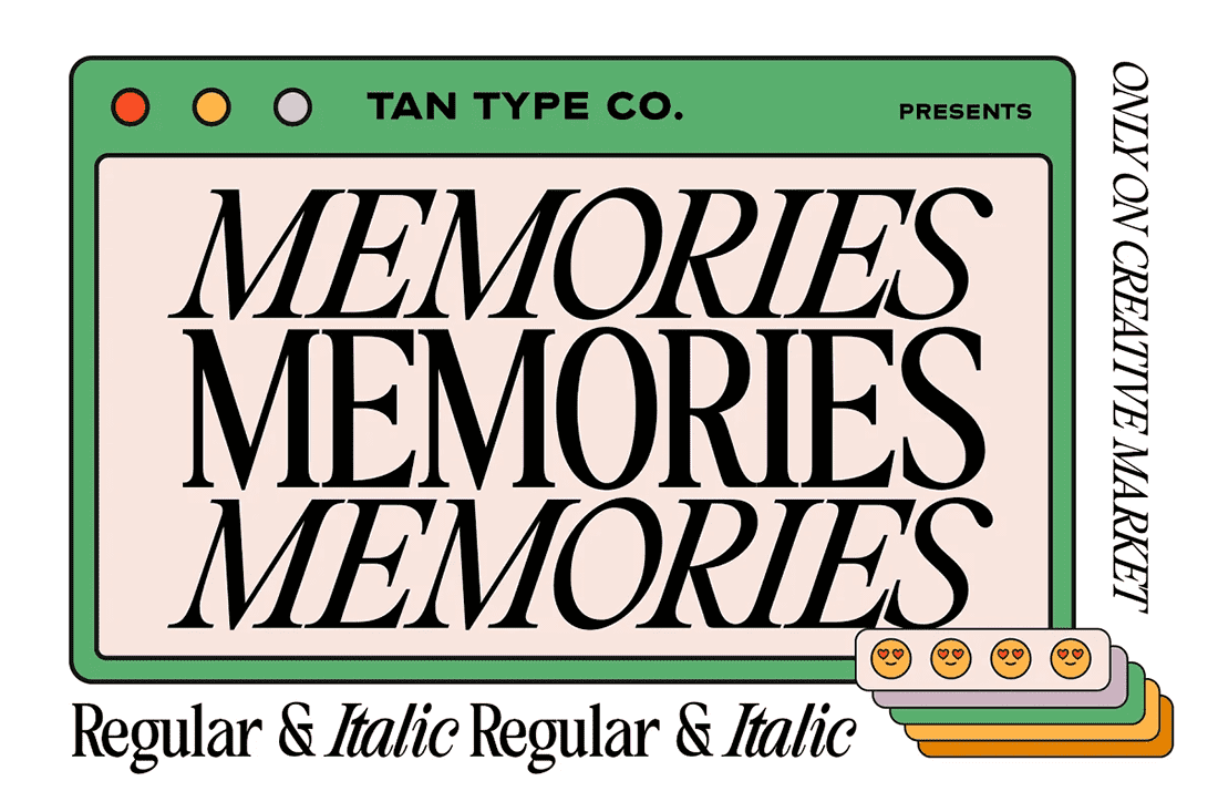
12. Morning Memories
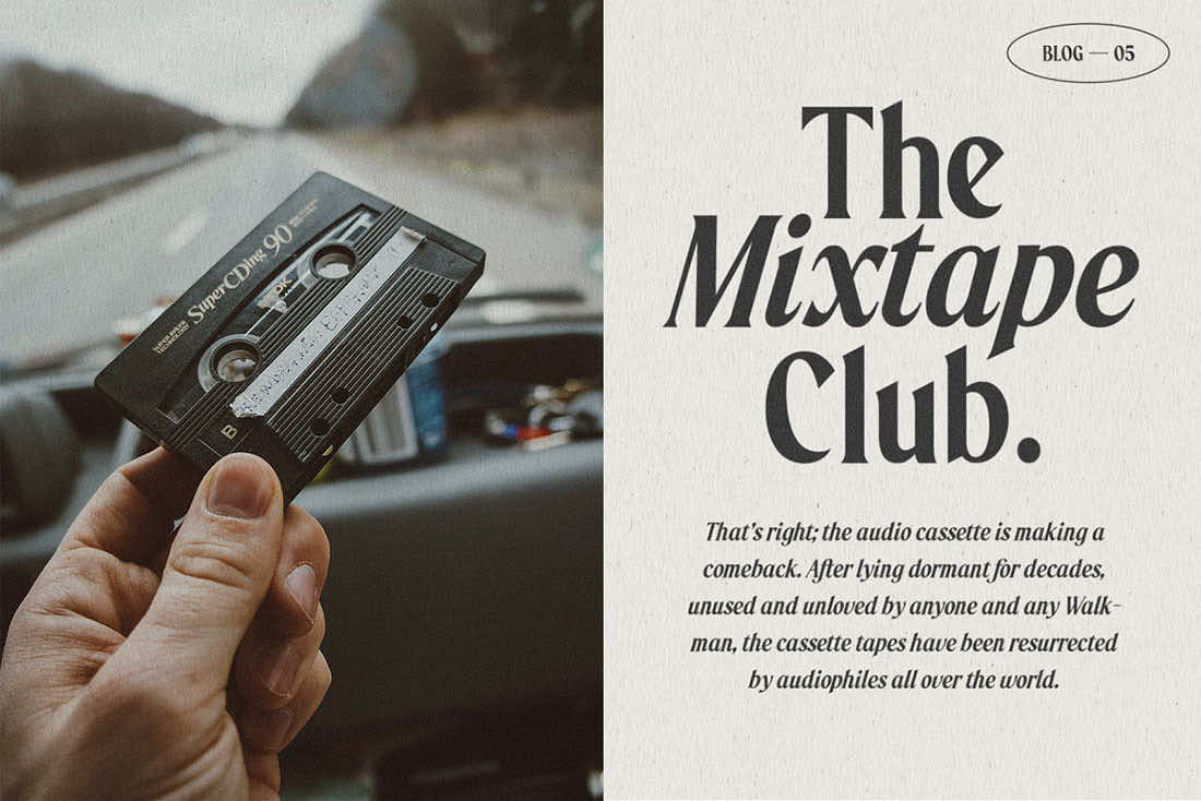
13. Mountriel
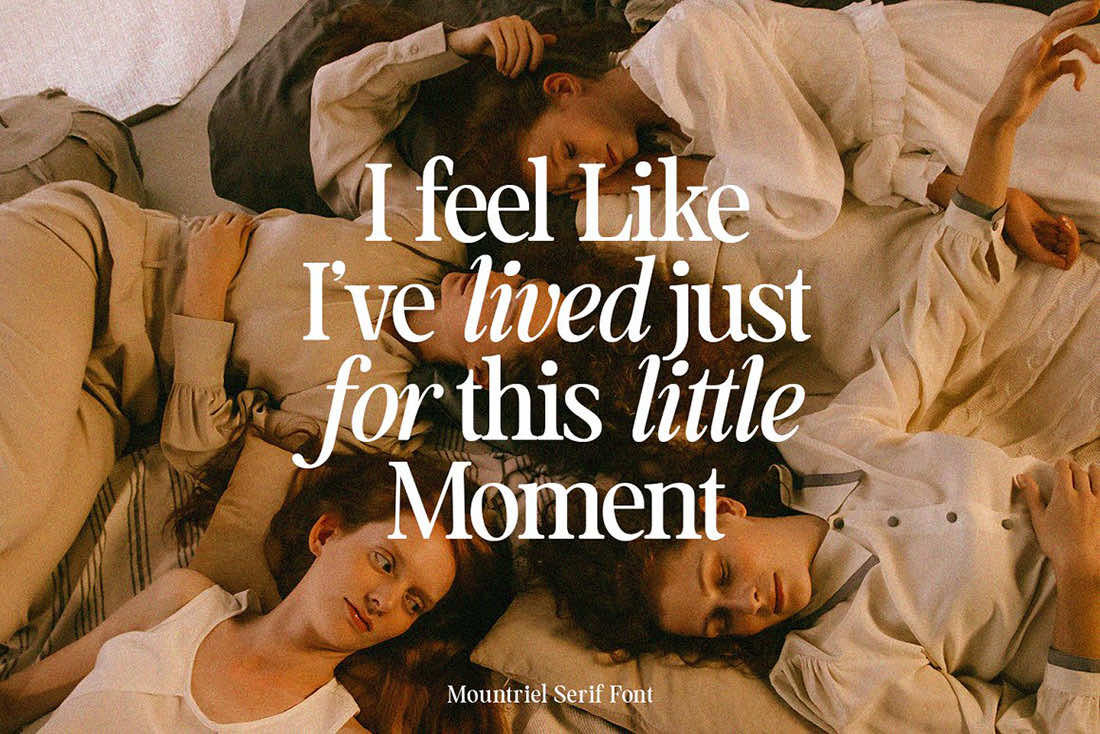
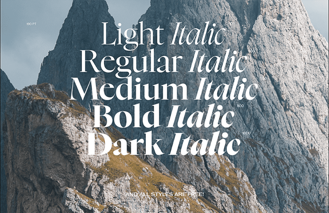
14. Nyght Serif (free for personal and commercial use)
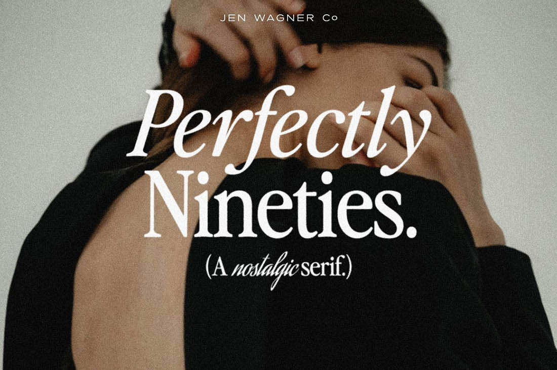
15. Perfectly Nineties
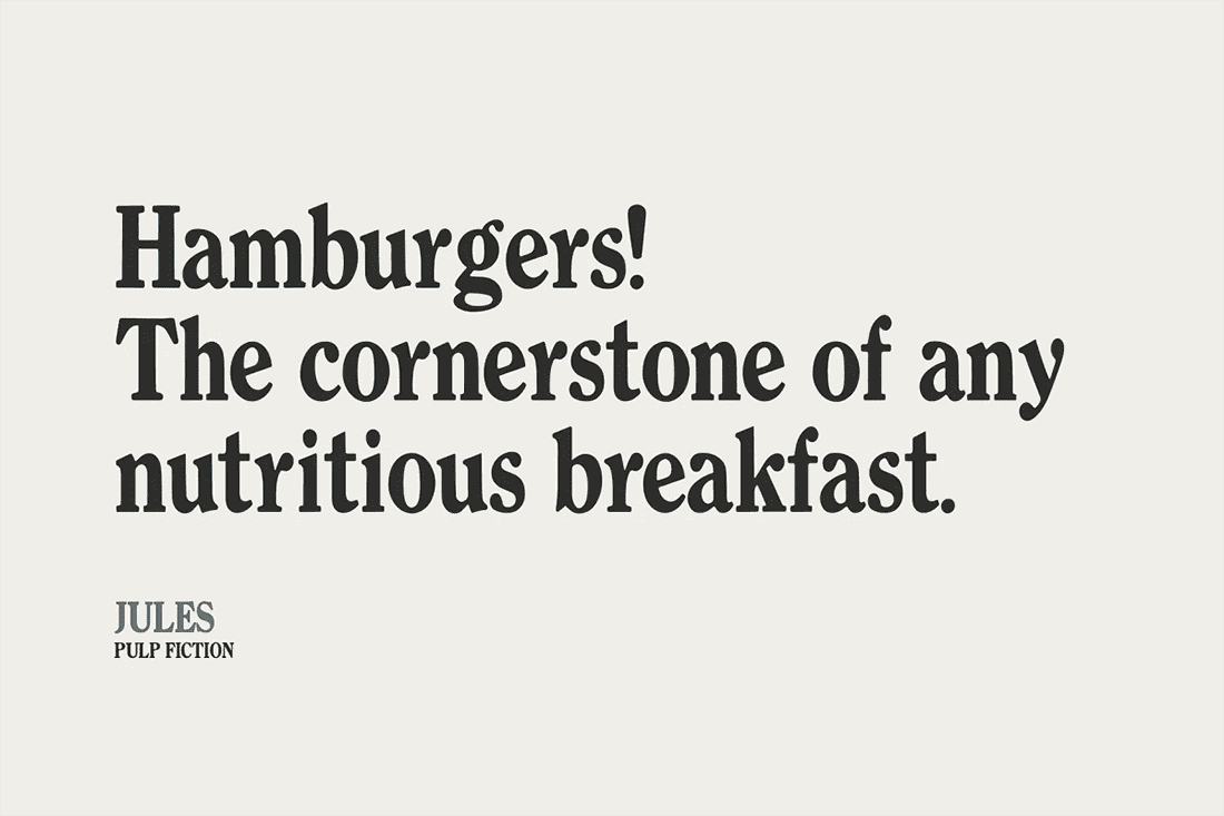
16. Quentin
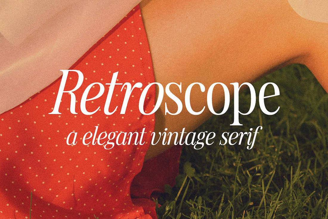
17. Retroscope
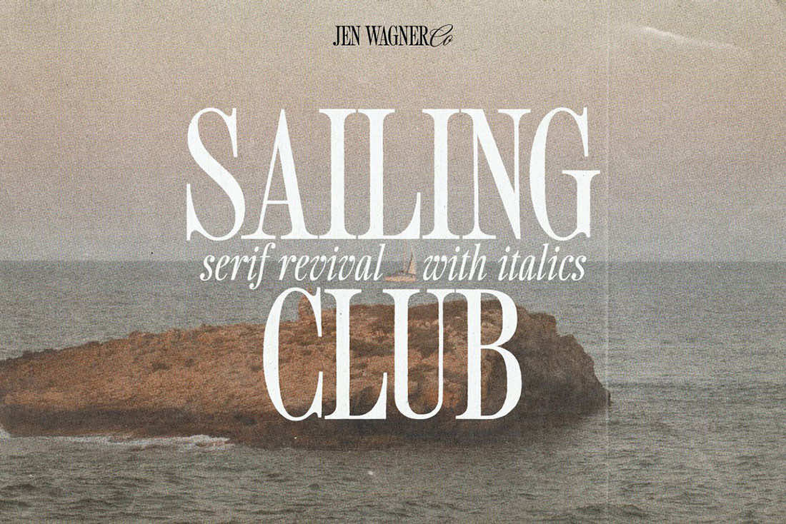
18. Sailing Club
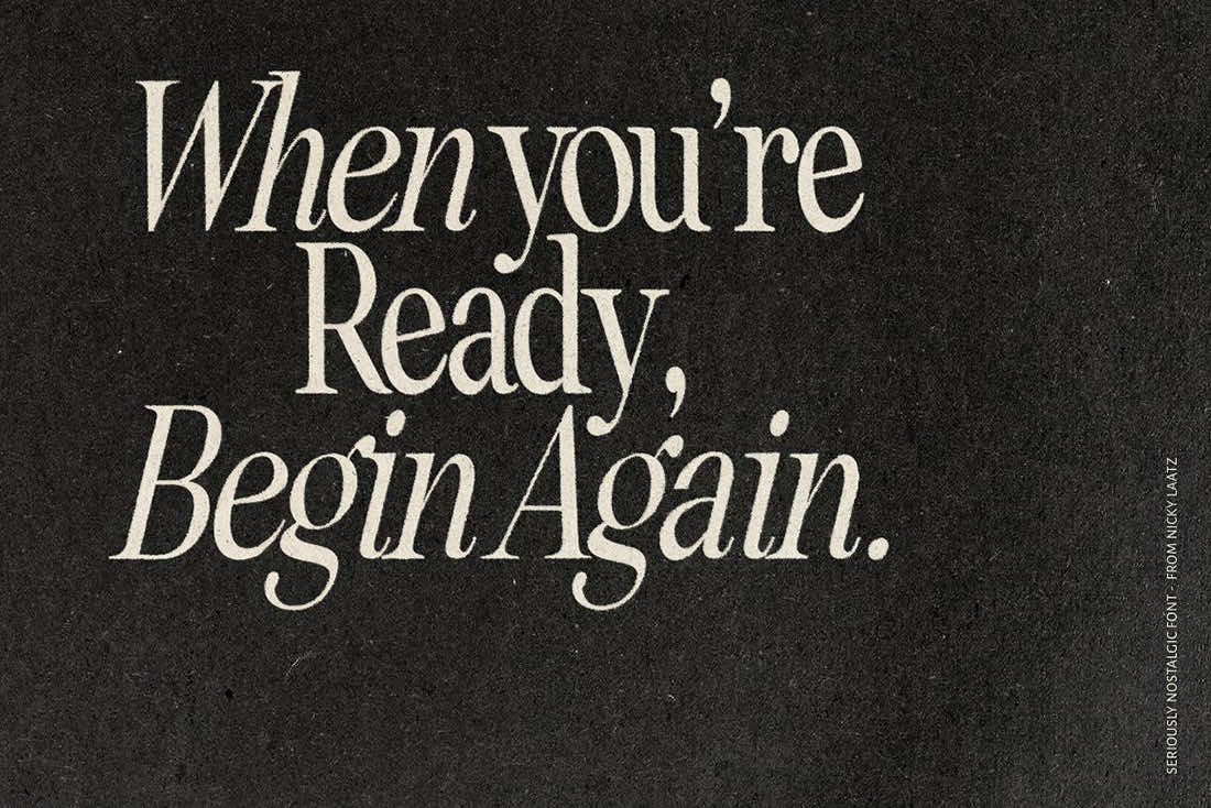
19. Seriously Nostalgic
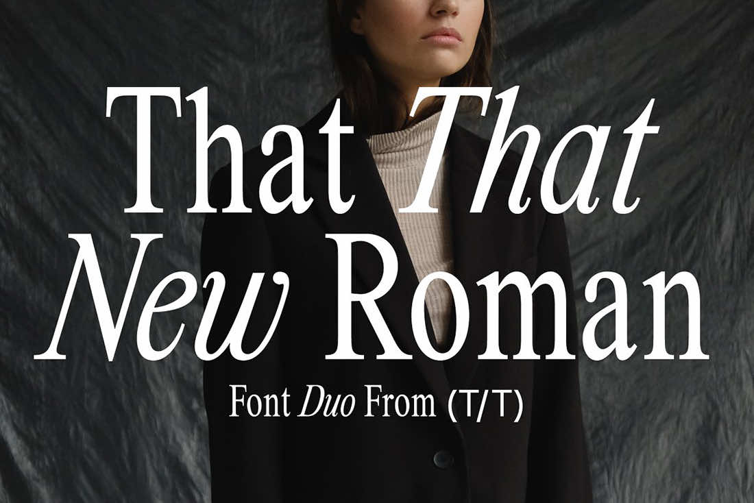
20. That That New Roman
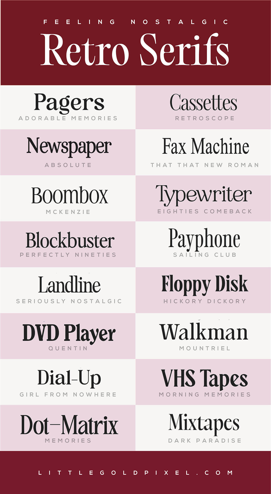
Bookmark for Later: Nostalgic Retro Fonts
THERE’S MORE WHERE THIS CAME FROM: More font roundups.
No Comments