This post contains affiliate links. Read the full disclosure here
Blame the chartreuse color trend on Etsy.
While Pantone is fully behind Classic Blue this year, Etsy put out the alert on chartreuse like a beacon in the night, coming from absolutely nowhere and maybe everywhere all at the same time.
According to Etsy trend expert Dayna Isom Johnson, chartreuse is Etsy’s color for 2020 because it’s bold and uplifting — “exactly what we’re all trying to embrace in 2020.”
That, coupled with the fact that My Domaine reported that there has been a 12% increase in searches on Etsy for green items and a 55% increase in searches for neon green items in recent months (compared with a year ago), shows that people must be climbing aboard the chartreuse caboose.
What exactly is chartreuse, anyway?
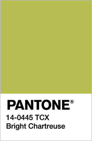
Let’s get really specific with a code: Pantone 14-0445 TCX.
And then let’s take it waaaay back, back to 1764. This was when the French liqueur chartreuse was introduced. Its color: directly between yellow and green on the color wheel, and slightly unhinged to boot.
But it wasn’t until 1885 that people started using chartreuse to describe this color. The Domestic Monthly defined it: “the delicate, pale green, with a yellow tinge, entitled ‘Chartreuse,’ is a rival to the renewed apple green.”
According to Nix Color Sensor, just as there are many shades of chartreuse (from lighter to darker, desaturated to neon, greener to yellower), the hue can run the gamut of emotions.
On the plus side it can evoke such feelings as joy, vibrance, cheerfulness, enthusiasm, happiness, nature, growth, spring. On the other hand, it can be associated with sickness, jealousy and cowardice.
Where have I seen chartreuse before?

Chartreuse has been in and out of popular culture for the past century.
- It started with feather fans, gowns, purses, shoes and hats in the late 1800s.
- In the 1920s, it returned in flapper dresses and the positively Gatsby-esque cocktail of choice, Last Word, which was a gin and chartreuse fusion.
- It returned in the 1960s as “acid green,” which looked great under a black light.
- There was a resurgence in 1988, which was documented in a New York Times article entitled “Suddenly It’s Chartreuse, Again.”
- It was last popular in the late 1990s as “lime green,” and some of us might remember the Spice Girls album covers and clothes that popped up out of this resurgence (some less fondly than others, myself included).
How to rock chartreuse
Chartreuse is one of those colors that you either love or hate.
Makeup expert Pablo Manzoni was quoted in the 1988 Times article as stating: “Chartreuse is a miserable color. Nobody looks good in it. Because of the high condensation of green and yellow, it is lethal, I repeat, lethal. The teeth look yellow. This is just a deadly thing.”
And I have to say I agree with him. My one fashion brush with chartreuse in the late 1990s left me scarred for life. It was a very cozy, very soft chenille sweater. And it made me look like a corpse. I have the photographic evidence to back this up, but it’s far too embarrassing to publish here, so don’t even ask!
Because of this, I highly recommend staying away from chartreuse clothing unless it is either (a) a very small accessory, (b) very far away from your face or (c) irrationally cute like this jacket.
My favorite way to rock chartreuse is with velvet furniture, home decor and accessories.
Realtor.com came up with a short guide for decorating with chartreuse, as it notes that the color is trending in home design.
“It’s such a great accent color when paired with the deep moody hues,” says Annabel Joy, co-founder of Trim Design Co., in Massachusetts.
In fact, I’ve noticed that chartreuse looks great with most of the trendy colors of recent years: living coral, ochre, classic blue — any shade of pink (even millennial!).

If you’re anything like me, this color palette guide may come in handy. Print it out and use it when you’re shopping — try buying clothing in pinks, purples, blues, corals and ochre, and accessorizing with chartreuse.
Likewise you can use this guide to put together a cohesive color palette for your bedroom or living room. Try a chartreuse chair, for instance, with pink throw pillows and a dark blue accent wall.
Chartreuse Color Trend: Gift Guide
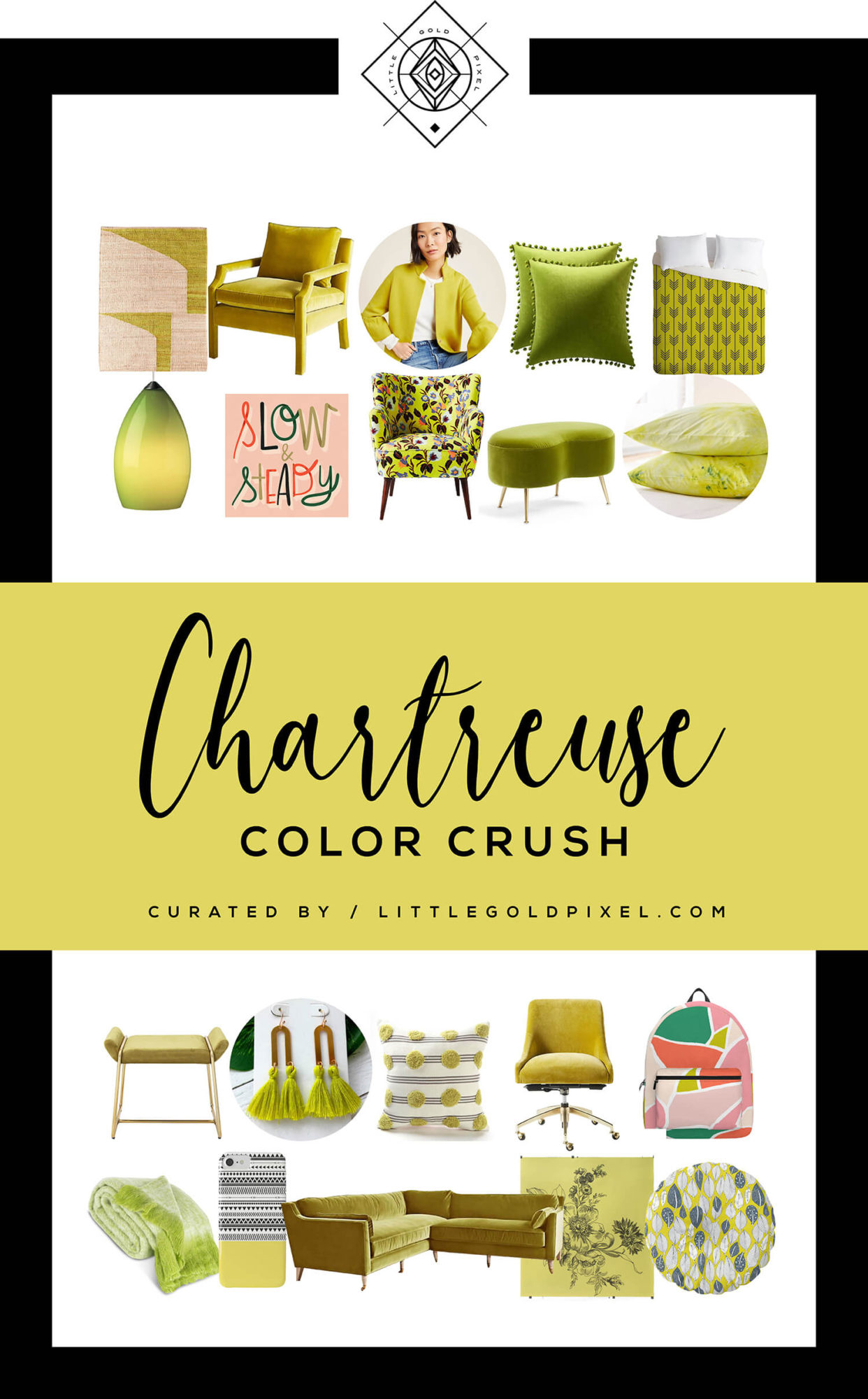
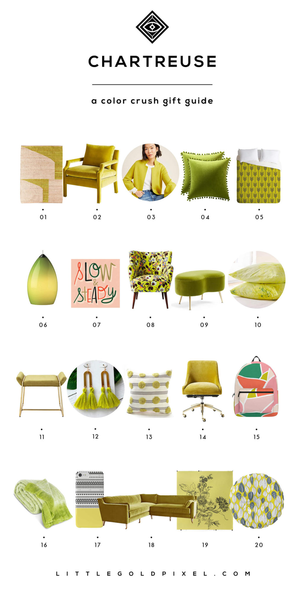
I’ve rounded up 20 bits of chartreuse that are easy to love.
Click on the corresponding link(s) below the image to shop!
Even more chartreuse
Click on the images to shop these additional chartreuse finds.
Bookmark for later
Here’s a chartreuse graphic to add to Pinterest or your favorite bookmarking site:
