This post contains affiliate links. Read the full disclosure here
Note: This post is second in a two-part series about brand design. Click here to read the first post: Why I Hired a Brand Designer (And Why You Should, Too)
When I first set out to rebrand at the end of last year, here’s what my logo looked like:
![]()
Oh, who am I kidding? It looked like this since 2014, just with a different tagline:
![]()
Not much of a logo, huh? I had these grandiose visions of creating a real logo, one that didn’t need words. Like Prince’s Love Symbol. Or the Golden Arches. Or the Nike swoosh. I wanted to invoke a little bit of beach, a little bit of rock ‘n’ roll. My entire brand identity wrapped into a symbol.
Just thinking about it made me tired. Hence the two-year period where I let Montserrat all-caps do the talking for me. I was about as original as every other blogger on the planet.
The Brand Design Process
When I set out to work with Corina Nika, however, I finally felt unblocked. Finally, I could articulate all the things I wanted for my brand. I gave her all my keywords, a Pinterest mood board and a whole lot of chatter about my hopes and dreams (she’s a class act for reading through all that drivel).
And she GOT me.
We started out with a concise mood board that took into consideration my goals, hopes and aesthetics.
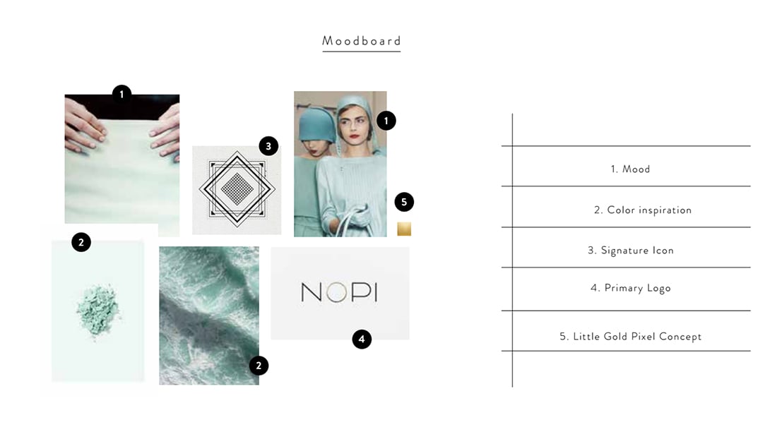
The next step was hashing out the color palette, which we kept simple: seafoam, black, gold and blood orange for the accent.
And from there she sent me three quality brand concepts. It took me roughly a week to spend time with them all and decide which ones spoke to me.
Here are a few that didn’t quite make the cut:
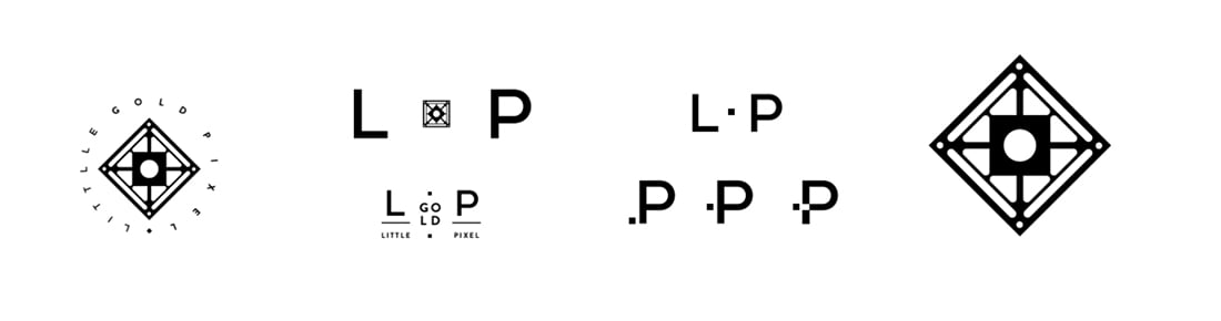
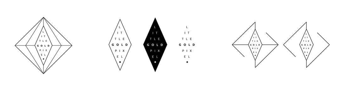
I still love them all, especially the open diamond. But I desired a symbol that could stand on its own, with or without the words “Little Gold Pixel” to back it up. So this concept clearly won out over the others:
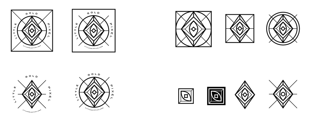
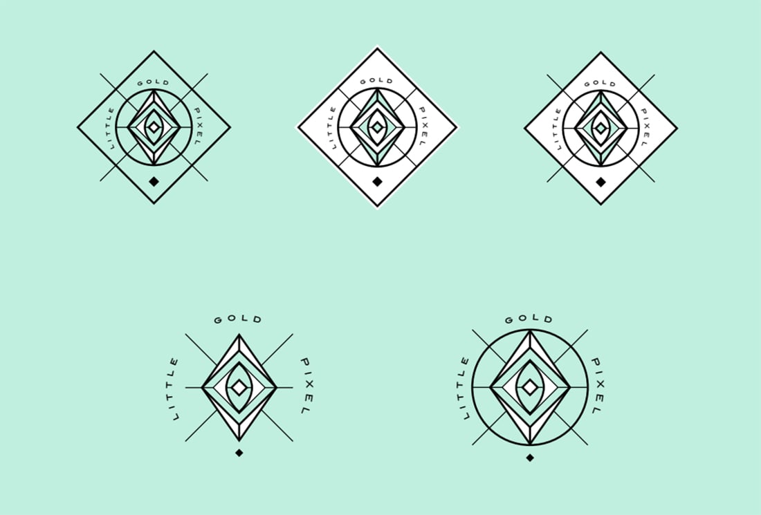
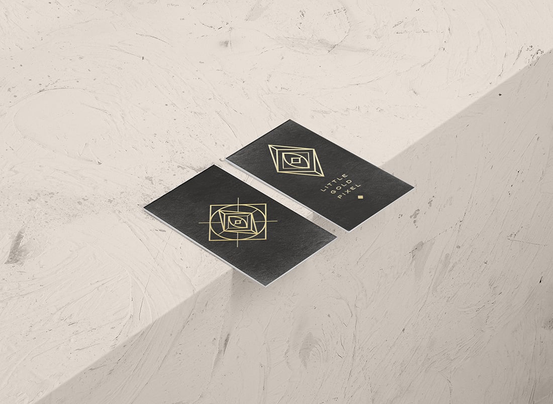
After another round of revisions, we ended up here:
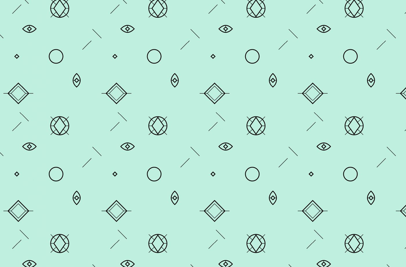
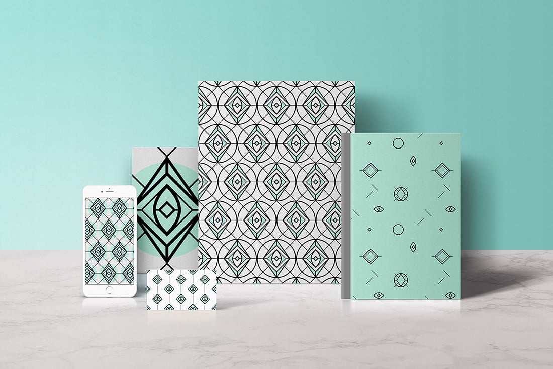
Next, we moved on to the patterns, which wow. How fun.
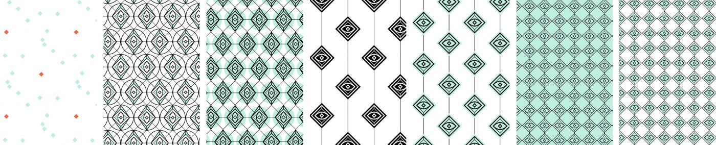
The perfectionist in me loved all the ordered, linear patterns. But I craved one more option: a breakdown. I had a crazy idea in mind that I ran past Corina, and she came back at me with the perfectly surreal pattern:
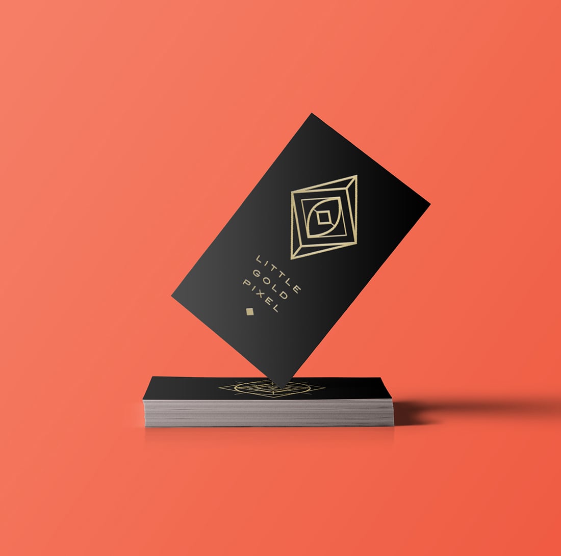
I couldn’t be more excited about where we ended up. From literally the most generic Montserrat logo to my self-contained Little Gold Pixel Kaleidoscope Logo.
The past few months I’ve been massaging my new brand identity into every aspect of my business. It’s more than just a logo or color palette; it’s a completely different way of thinking about your business goals. I highly recommend that every entrepreneur or want-repreneur invest in their own brand design.
I can’t stress enough how important it is to find the right designer for your brand. Corina was perfect for me because of our similar aesthetics, the fact that she lives a beach lifestyle in Greece (so jealous!) and her unique perspective and knack for minimal design that feels substantial. These are all things I wanted to emphasize in my brand: easy yet sophisticated; beach yet rock ‘n’ roll; modern yet classic.
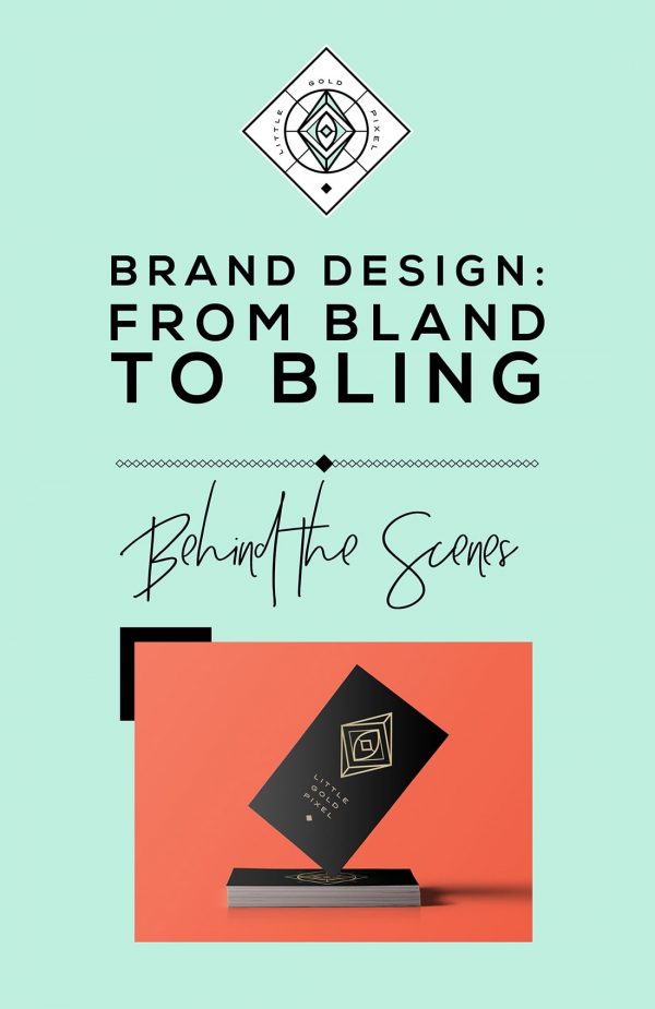
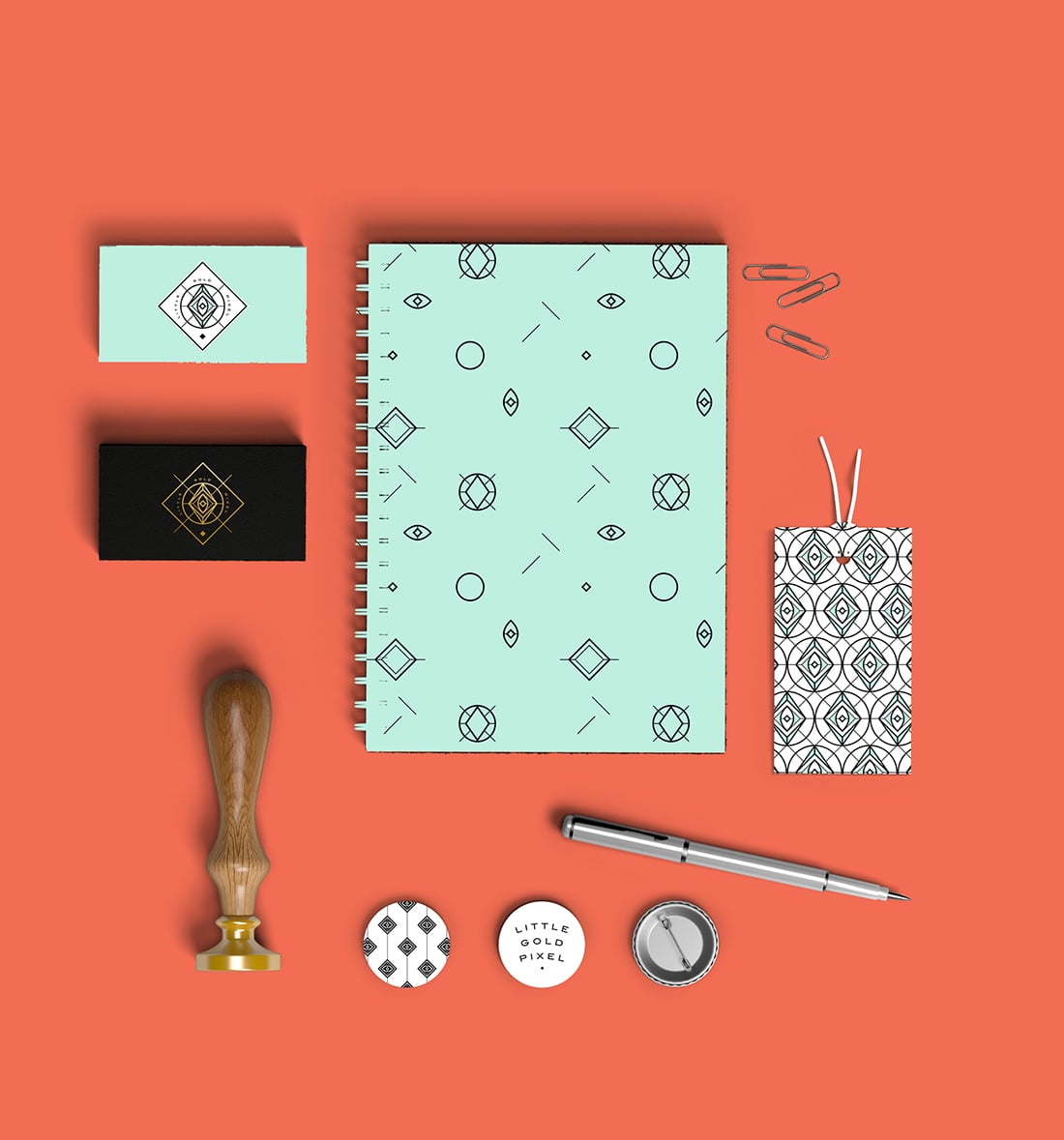
The Results
Here are a few examples of the new Little Gold Pixel branding.
Logo type font: Nexa Bold
Color palette: Seafoam, Black, Gold, Blood Orange
Save for later: