When people ask me about making printables, the same thing comes up over and over:
Typography.
More specifically: typography rules.
If you’re new to design or just aren’t sure how to take your idea to the next level, this post is for you.
I won’t pick out your fonts for you. In fact, in my examples below I gave very little thought to the actual fonts I used. The actual typography you pick out should be individual, like your taste, because that’s exactly what it’s all about. There are well-made fonts, and there are crappy fonts, and there’s a time and a place for certain kinds of fonts, but let’s stick with the basics today.
All you need to know is never use Comic Sans or Papyrus. They make the design gods cry.
Aside from that, here are some simple typography rules to make the fonts of your choosing really shine.
5 Simple Typography Rules
First, let’s see what it looks like when we break all five rules at once:
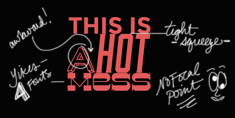
YIKES.
Where to start?
1. Three typefaces MAX.
The example above has five words and SIX typefaces. What the what?! You’re probably aware of the subway art trend, in which various phrases are mashed together in a million different fonts. Most of these posters make my eyes bleed. The single easiest way to make your designs look professional is to resist the urge to pile on the fonts. Less is more.
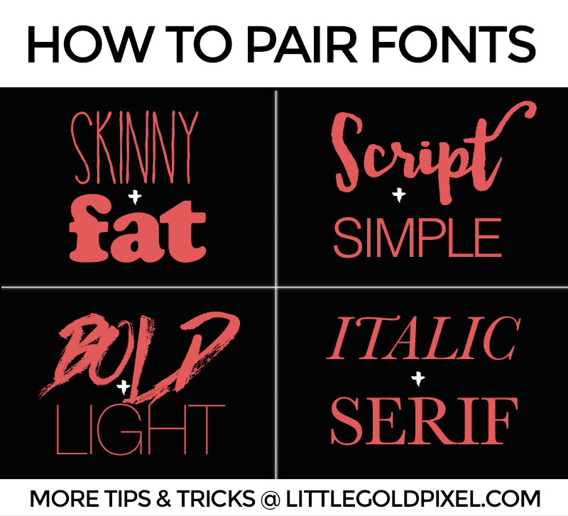
2. Opposites attract.
This isn’t a hard and fast rule, but it’s definitely a useful thing to remember when you’re searching for the perfect fonts for a project. Try to avoid two fonts that clash together.
Much like you wouldn’t wear two similar shades of green at the same time, don’t use too similar but slightly different fonts on the same project. The overall vibe will feel disheveled and slightly off.
The best/fastest way to find two compatible fonts is to find the opposite. Got a skinny font? Find a fat font. Got a serif font? Try a sans serif font. Got a fancy font? Try a simple font.
Sometimes you don’t even need to leave the font family to find a compatible font.
Try a different weight of the same font! For instance, try Helvetica Bold with Helvetica Light. Also reliable: mix and match regular/bold weights with light italics.
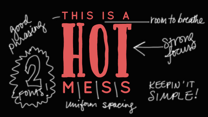
3. Watch your spacing.
Known as kerning (space between letters) and leading (space between lines), spacing is super important.
Bad kerning or leading can kill a design even faster than too many typefaces. The fallback guideline would be to err on the side of more space than less space.
Just like you’d rather run free in a meadow a la Julie Andrews in The Sound of Music than be trapped in an elevator, do not confine your design. Let it breeeaaatthhhe.
More reading on kerning, leading and tracking here.
4. Watch your phrasing/hierachy.
In the example above, does it bother you how I randomly put the “a” in front of “hot”? Does it seem out of place to you? If so, congrats, you have eyes.
When you are designing a phrase on a page, you want to think about the words. What is it that you’d like to bring into focus? Which words are least important? How can you minimize the trivial words and boost the best words?
You have to make your focus words large and bold. The trivial words are still important, but they need the secondary font, the smaller type, so they can fade to the background.
In the example phrase, “This is a hot mess,” “hot mess” are more important than “this is a.”
See exhibit B, an improved version of our troubled example:
Which leads me to the last tip:
5. KISS.
Keep it simple, stupid. I am as prone as anyone to over-designing.
Sometimes I pile on the embellishments so high I think my screen is going to collapse from the weight of all my craziness. But then I step back a second and start deleting the layers, one by one, till the printable feels right.
There’s that Coco Chanel quote that holds true in this situation: “Before you leave the house, look in the mirror and take one thing off.”
It’s as good for typography and design as it is for fashion.
More resources
Hopefully this guide helps you with your type pairings. If you’ve got a printable or a phrase in the works that you’d like me to break down for you, I’d be happy to take a look. Send me an email: vanessa (at) littlegoldpixel.com.
P.S. Want to design a printable but are unsure where to start? Check out my design resources page.
P.P.S. Freebies galore & my favorite fonts.