According to my inbox, a lot of you are living with bare walls because you’re unsure how to mix art like a pro.
In fact, I see more variations on this one question than I can shake a fist at:
How do you mix wall art that matches but that doesn’t look matchy-matchy?
This is such a common problem — and I think it has to do with big box stores and their generic multi-piece art packages. You know, the kind that look like they belong in a hotel room.
Remember “What Not to Wear”?
I think wall art is a lot like clothes. And Stacy and Clinton had it right when they said you shouldn’t wear things that match, you should wear things that gooooo. (I miss that show!)
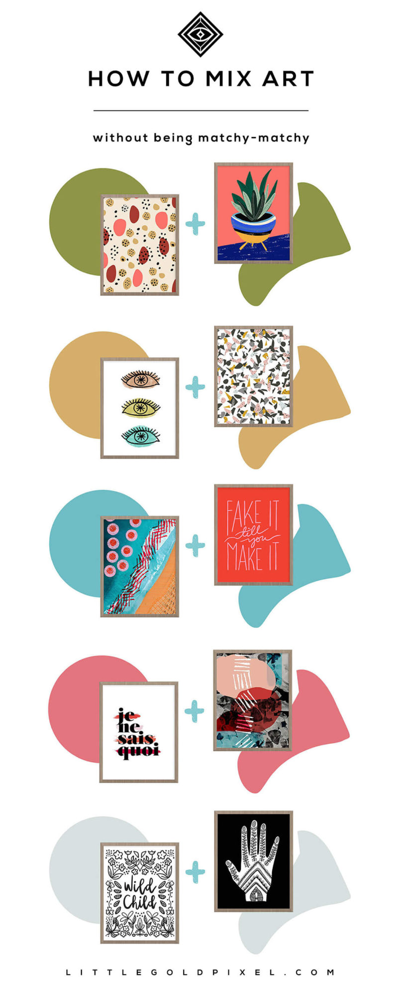
I’ve taken the liberty of pairing up some printables from my shop, and I’ll explain a little about what makes them gooooo together.
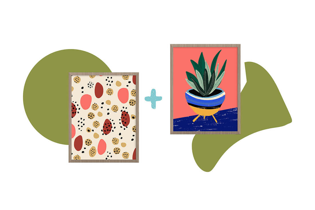
1. Terracotta Desert + Midcentury Plant
Why it works: These two pieces share a common midcentury vibe. One is an abstract pattern and the other is an illustration, but they both have organic elements common in midcentury art that make them cohesive. (Not to mention both have ONE common color: living coral)
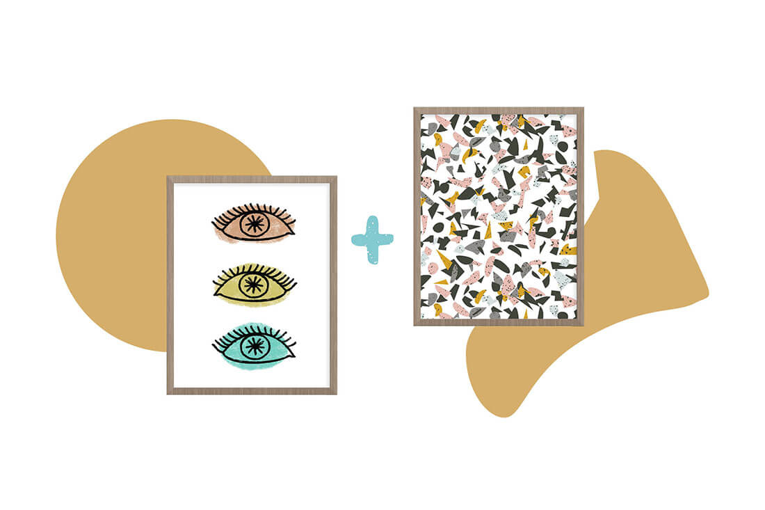
2. Evil Eyes + Terrazzo Pattern
Why it works: These two pieces have balance. One is simple and symmetrical, the other chaotic and haphazard. They even each other out. The colors are not exactly the same, but they have a similar cool color palette, which is pleasant to the eye.
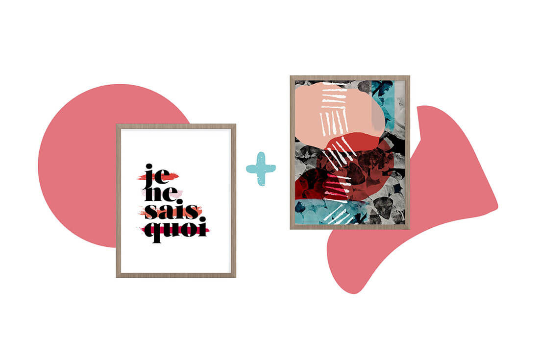
3. Je Ne Sais Quoi + Just Passing Through
Why it works: These two pieces provide contrast. One is shapes, the other text. This is a very effective way to mix art. Walls that are missing one or the other tend to feel static.
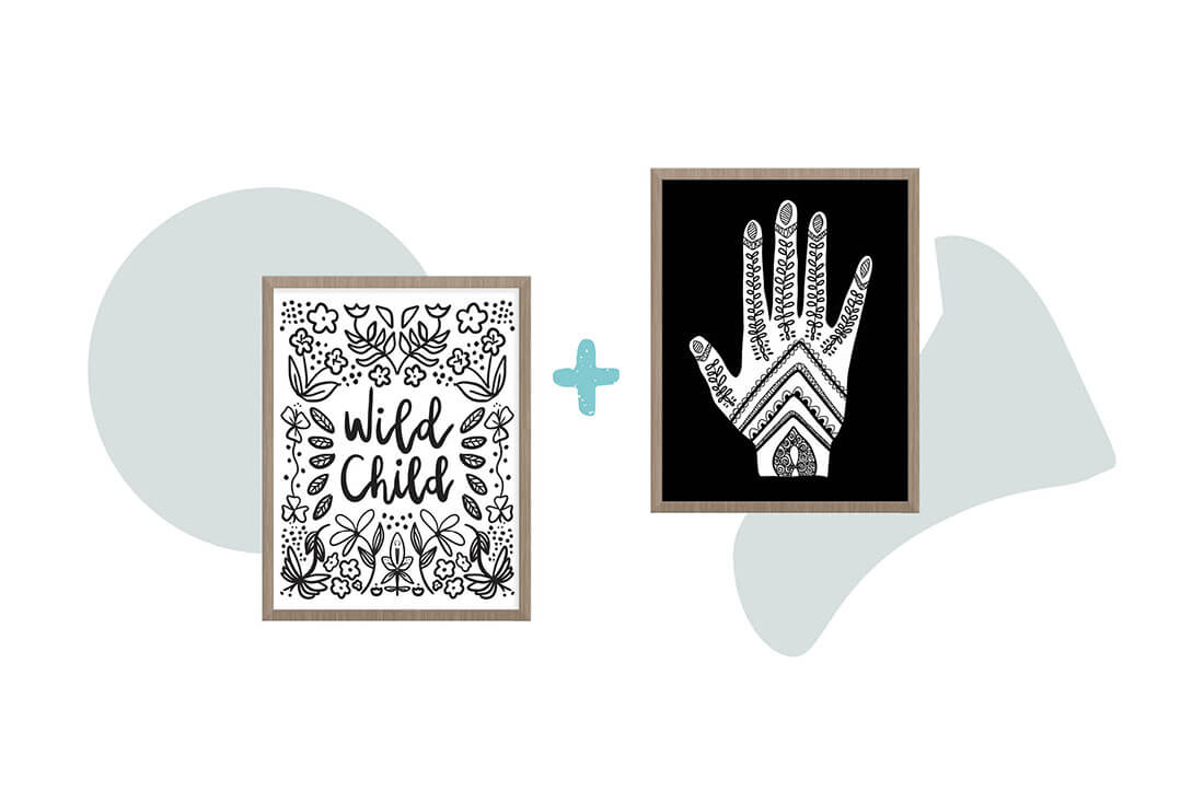
4. Wild Child + Henna Hand
Why it works: These two pieces are monochrome but the background hue is reversed to add a little necessary tension. (So they goooo instead of match.)
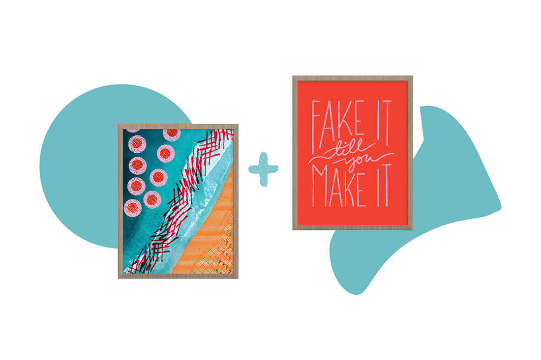
5. Ocean Collage + Fake It
Why it works: These two pieces share just enough colors to create cohesion, but not enough to make the pair boring. The red and pink mimic each other with just the right amount of flair.
Which pair is your favorite? Tell me in the comments below!
Bookmark for later
